Summary
To avoid the confusion detailed below, let's make some modifications on the Approve Partner button to provide more context and details on troubleshooting. Here are a few things that I think would improve the experience:
- Always show the "Approve Partner" button.
- Disable the "Approve Partner" button in case they are unable to click the button.
- Add a tooltip next to the disabled "Approve Partner" button that says that the Partner needs to go in "My Organization" and click "Request Approval". Including a b
- Move the button to the top of the page instead.
Things to Consider
The button in question is accessible by clicking the "Review Application" button:

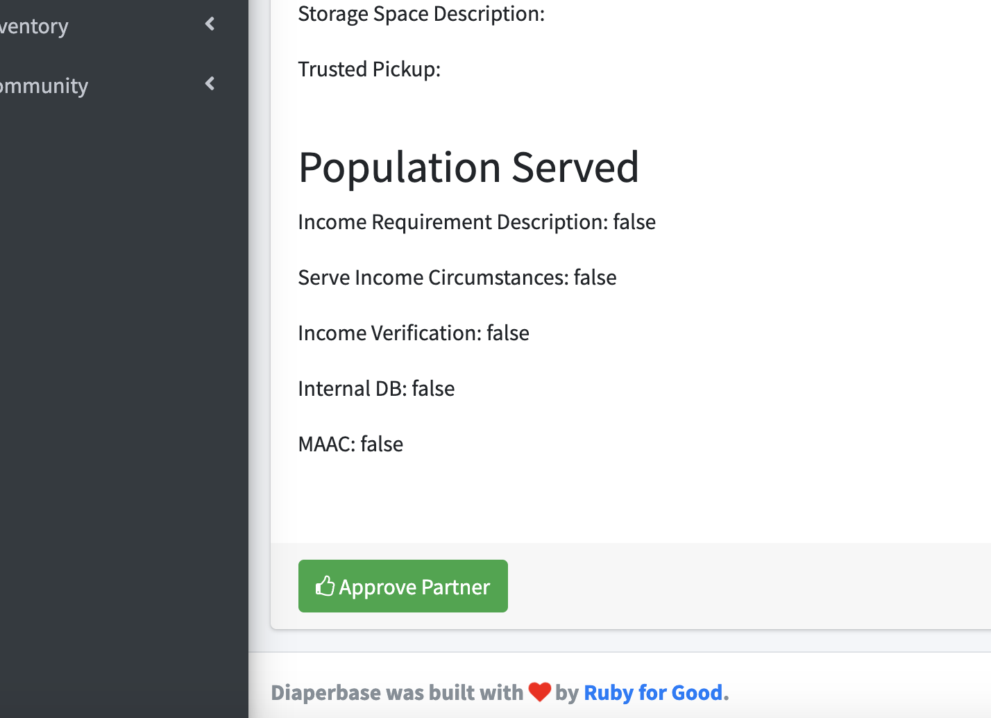
And on this page on the bottom:
Criteria for Completion
Bonus Round
I think a really good UI for this is using a fixed element on the bottom with the approval button on the bottom right. Like how this jsfiddle does it - https://jsfiddle.net/girishgowdayt/RUDWS/
I figure this would be a nice approach since the the button will always be visible regardless of scrolling we still encourage the diaperbase user to review the application.
Summary
To avoid the confusion detailed below, let's make some modifications on the Approve Partner button to provide more context and details on troubleshooting. Here are a few things that I think would improve the experience:
Things to Consider
The button in question is accessible by clicking the "Review Application" button:

And on this page on the bottom:

Criteria for Completion
@partner.awaiting_review?is falseBonus Round
I think a really good UI for this is using a fixed element on the bottom with the approval button on the bottom right. Like how this jsfiddle does it - https://jsfiddle.net/girishgowdayt/RUDWS/
I figure this would be a nice approach since the the button will always be visible regardless of scrolling we still encourage the diaperbase user to review the application.